
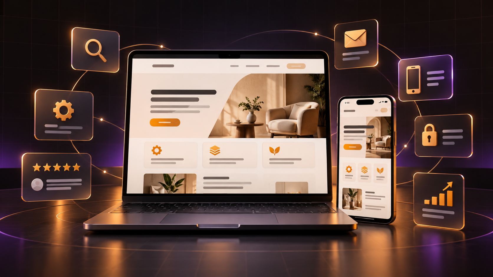
A small-business website does not need to be enormous. It does not need dramatic animation on every scroll, a complicated menu or fifteen pages nobody will read. It needs to help the right visitor understand the business, trust it and take the next step.
That sounds obvious, but many websites are built from a list of trendy features instead of customer questions. The result may look impressive in a screenshot while leaving a real visitor unsure about the service, price range, location or how to make an enquiry.
I use the checklist below when thinking through websites for service businesses and growing brands. The details change from one company to another, but the underlying jobs remain surprisingly consistent.
1. A clear promise on the first screen
The top of your homepage should answer three questions quickly: what do you offer, who is it for and what should the visitor do next?
“Welcome to our website” does not answer any of them. Neither does a clever headline that sounds beautiful but hides the actual service. A useful homepage headline might say that you provide bookkeeping for Nigerian startups, design conversion-focused ecommerce stores or deliver healthy meals across Lagos. Clarity earns attention.
Support the headline with one short explanation and a visible action, such as “Book a consultation,” “View our work” or “Shop the collection.” The action should match how customers genuinely buy from you.
2. The essential pages customers expect
Most small-business websites can begin with five core pages: Home, About, Services or Products, Work or Testimonials, and Contact. Some businesses can combine a few of these; others will need separate pages for each service.
- Home: Introduces the value, builds confidence and directs visitors.
- About: Explains the people, experience and point of view behind the business.
- Services or products: Makes the offer, process and suitable customer clear.
- Proof: Shows case studies, results, testimonials or credible examples.
- Contact: Gives visitors a simple, reliable way to take action.
Add pages because customers need them, not because another website has them. A restaurant may need a menu and locations. A consultant may need detailed service pages and a booking form. A regulated business may need policy and compliance information.
3. Proof that feels specific and believable
Anybody can write “we deliver excellence.” Proof shows what that means.
Use testimonials with a real name, role or company where permission allows. Explain what changed for a client instead of only displaying a gallery. Show work that resembles the kind of project you want to attract. If your company is new, demonstrate expertise through a clear process, useful content, founder experience or carefully developed sample work.
Small trust details matter too: a professional email address, current contact information, working social links, consistent branding and accurate spelling. Nigerian customers are rightly cautious online. If a website feels abandoned or vague, even an interested visitor may decide not to risk an enquiry or payment.
4. A mobile experience that is genuinely usable
Your website should not merely shrink to fit a phone. Text must remain readable, buttons should be easy to tap, forms should not feel exhausting and important content should not be hidden behind decorative effects.
Test the site on an ordinary phone and a typical mobile connection, not only on a large design monitor with fast Wi-Fi. Compress oversized images. Avoid autoplay video unless it adds real value. Keep navigation straightforward and make sure fixed buttons do not cover the content.
A good mobile experience often comes from restraint. When every animation, image and section has to justify its place, the website becomes faster and easier to understand on every screen.
5. Contact and conversion paths without friction
Decide what conversion means for the business. It may be a purchase, call, WhatsApp message, booking, email enquiry or visit to a physical location. Then make that next step easy to find throughout the site.
Keep forms as short as possible while still collecting useful information. If you ask twelve questions before the first conversation, explain why. Tell visitors what will happen after they submit: when you usually reply, whether they will receive a quote and what information they should prepare.
For businesses that use WhatsApp, a direct link can be helpful, but it should not be the only contact option. Some customers prefer email, a form or a phone call. Give people a sensible choice without overwhelming them.
6. Basic SEO foundations on every important page
Search engine optimisation begins with useful pages, not a hidden list of keywords. Each important service should have enough clear, original information for a potential customer to understand it. Use descriptive page titles, one logical main heading and subheadings that reflect the questions people actually ask.
If your business serves a location, mention it naturally where relevant. “Web designer in Nigeria” should appear because the service and location matter to the reader, not because the phrase has been copied into every paragraph. Include accurate business details and connect the website to a complete business profile where appropriate.
Technical basics matter as well: descriptive image text, crawlable links, a secure connection, a sitemap and pages that load reliably. My web design approach treats content, structure and visual design as one experience because SEO traffic is wasted when the page itself is confusing.
7. Content that answers the questions delaying a decision
Write down the questions customers ask before hiring or buying from you. Those questions are often the best website outline you will get.
Explain who the service is for, how the process works, what is included and what affects the price or timeline. You do not always need to publish a fixed price, but completely avoiding money can create unnecessary uncertainty. A starting price, typical range or explanation of the factors involved may help visitors qualify themselves.
A blog can support this work when you have something useful to say. It should deepen your expertise and answer related questions, not exist as a box to tick. A few thoughtful articles are more valuable than dozens of thin posts written only to repeat a keyword.
8. Things your small-business website may not need
You may not need a homepage slider, background music, a chatbot, a customer login, a daily blog or a complicated content-management system. Every feature creates a cost: it has to load, work on mobile, remain accessible and be maintained.
Start with the simplest website that communicates the business properly. Add features when a real customer or operational need appears. This approach leaves more time and budget for the parts people notice most: clear content, credible proof, strong imagery and a smooth path to action.
A short website checklist before you launch
- Can a new visitor explain what the business offers after five seconds?
- Is the main next step clear on every important page?
- Do all contact links, forms and buttons work?
- Does the website remain readable and usable on a small phone?
- Are services, locations, opening times and contact details accurate?
- Is there enough real proof to support the promises being made?
- Does each page have a specific title, heading and useful purpose?
- Can someone on the team keep the essential content updated?
A professional small-business website is not the one with the most sections. It is the one that removes uncertainty and helps a customer move forward with confidence.
If your current site is missing that clarity, you can look through my selected web projects or tell me what you want the website to achieve.