I have noticed something about the way businesses talk about their websites. They rarely say, “Our website is not communicating what we need it to communicate.” Instead, they say, “It looks old,” “It no longer feels premium,” or simply, “We need something modern.”
I understand the feeling. When you see the same homepage every day, you start noticing every image, empty space and button. Then you visit another company’s website, see beautiful typography and smooth animation, and suddenly your own site feels terrible.
Sometimes that feeling points to a real problem. Quite often, though, the website is still doing its job. You have simply become too familiar with it.
Familiar does not always mean outdated
You know your website too well. You know where every section sits, which project appears first and what the About page says. A first-time visitor has none of that history. They are not comparing today’s homepage with the version you launched three years ago. They are trying to answer a few practical questions:
- What does this business do?
- Is it meant for someone like me?
- Does it look credible?
- Can I find what I need without struggling?
- What should I do next?
If a new visitor can answer those questions quickly, your website may not need a complete redesign. It may need fresh photography, clearer copy, updated case studies or a few focused improvements.
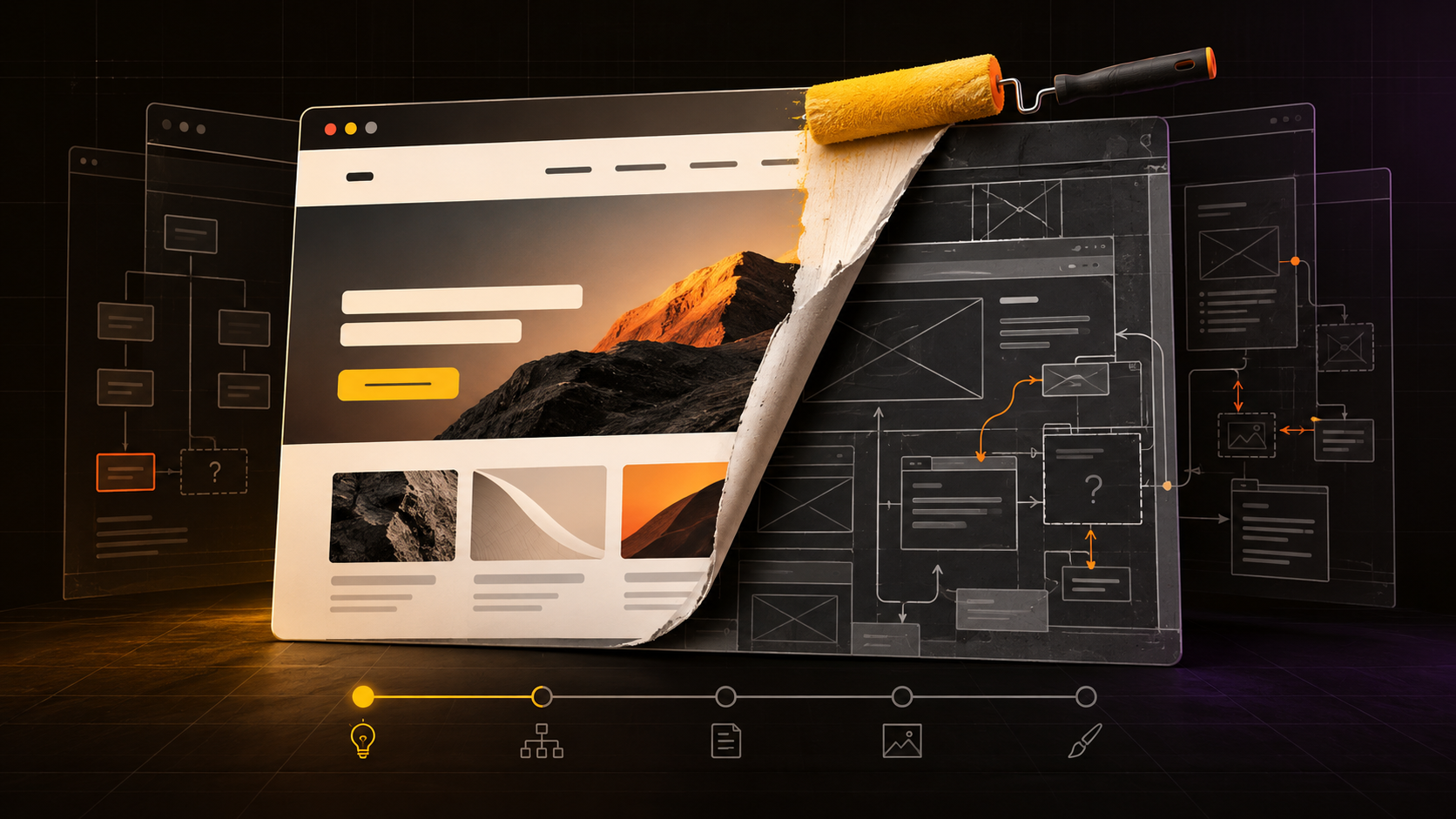
A redesign can hide the real business problem
Design problems are comforting because they are visible. You can point at a colour, replace a font or rearrange a page. Positioning and offer problems are harder. There is no red circle showing that your service is confusing or that customers cannot see why they should choose you.
That is why a redesign can feel like progress even when it avoids the difficult work. A consultant is attracting the wrong clients, so the colours change. A studio cannot explain its value, so it commissions a new logo. A company has a weak offer, so another section is added to the homepage.
The result may look polished, but it still cannot answer the customer’s most important question: “Why should I choose you?” Good web design can strengthen a clear business. It cannot invent clarity that does not exist.
What should you fix before redesigning?
Before opening Figma or hiring a web designer, step back from the visual layer. Start with the job your website is supposed to do. Do you want visitors to book a call, buy a product, understand a complicated service, view your work or trust you enough to send an enquiry?
Once that goal is clear, review the foundations:
- Positioning: Can people tell who you help and what makes your approach different?
- Offer: Is the service or product easy to understand?
- Content: Does the copy answer real customer questions, or is it mostly vague marketing language?
- Structure: Can visitors move from interest to action without getting lost?
- Proof: Do you show credible work, results, testimonials or examples?
Sometimes this review reveals that the visual design is not the main issue. A copy and content update may create more value than rebuilding the entire website.
When a website redesign is genuinely necessary
I am not against redesigns. I design websites for a living. I have worked on projects where the existing site could no longer carry the business: the structure was confusing, the identity had become inconsistent, the content was outdated and the overall experience made the company appear smaller than it really was.
A redesign makes sense when:
- Your business, audience or services have significantly changed.
- The website performs poorly on mobile or is difficult to use.
- Visitors regularly struggle to understand what you offer.
- The current platform prevents important updates or integrations.
- The brand no longer reflects the quality and direction of the business.
- Analytics and customer feedback reveal clear conversion problems.
Those are strategic reasons. “I am bored with it” is not.
Premium is not a visual preset
Businesses often ask for a redesign because they want to look more premium. That usually becomes a predictable recipe: black background, serif typeface, plenty of whitespace and a slow fade animation.
But premium is not one visual style. A premium experience is one where the customer feels very little uncertainty. The information is clear. The presentation feels considered. The process makes sense. Every detail supports the same promise.
A brand can be loud, colourful and playful while still feeling valuable. The important thing is not whether the website follows a trend. It is whether the design makes sense for the business and helps the visitor make a confident decision.
Redesign with evidence, not restlessness
Before replacing your website, show it to people who have never seen it. Watch what they understand, where they hesitate and what they miss. Review your enquiries and analytics. Talk to customers. Find the actual points of friction.
You may discover that you need a new website. You may also discover that the current one needs better words, stronger proof and a clearer path forward.
Either outcome is useful. The goal is not to keep a website forever. It is to avoid spending time and money redesigning the surface when the real problem is underneath it.
If your website is no longer communicating the value of your business, tell me what is not working. We can figure out whether you need a full redesign or a more focused fix.