
AVIENNA — A jewellery website that brings the feeling of a private showroom online, using rich colours, expressive typography, and an interactive product showcase to make each piece the centre of attention.
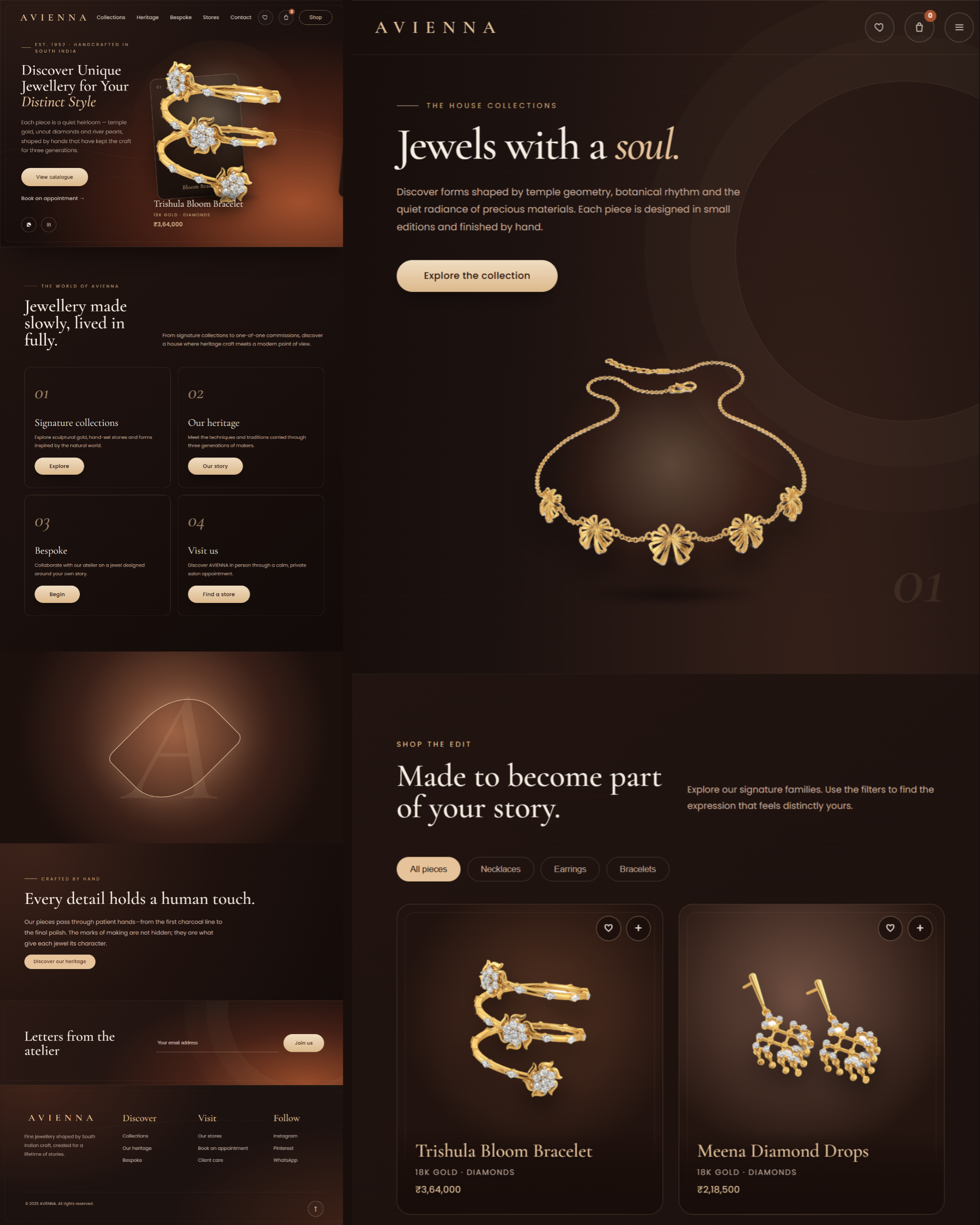
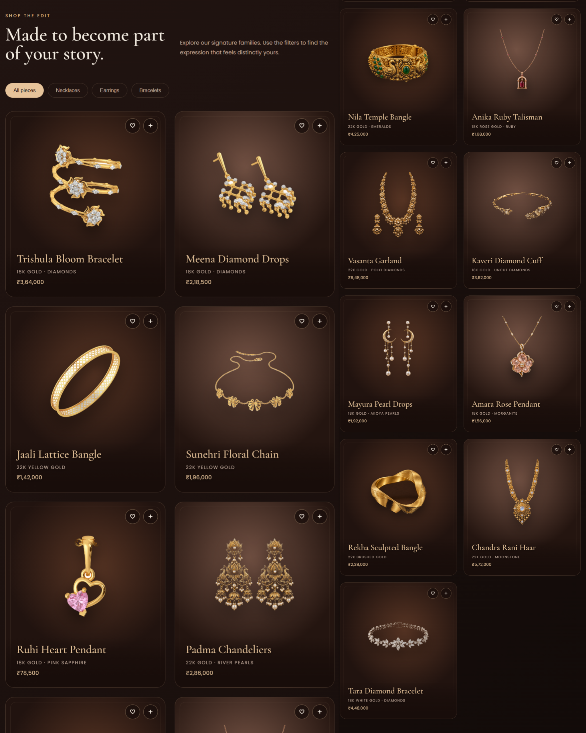
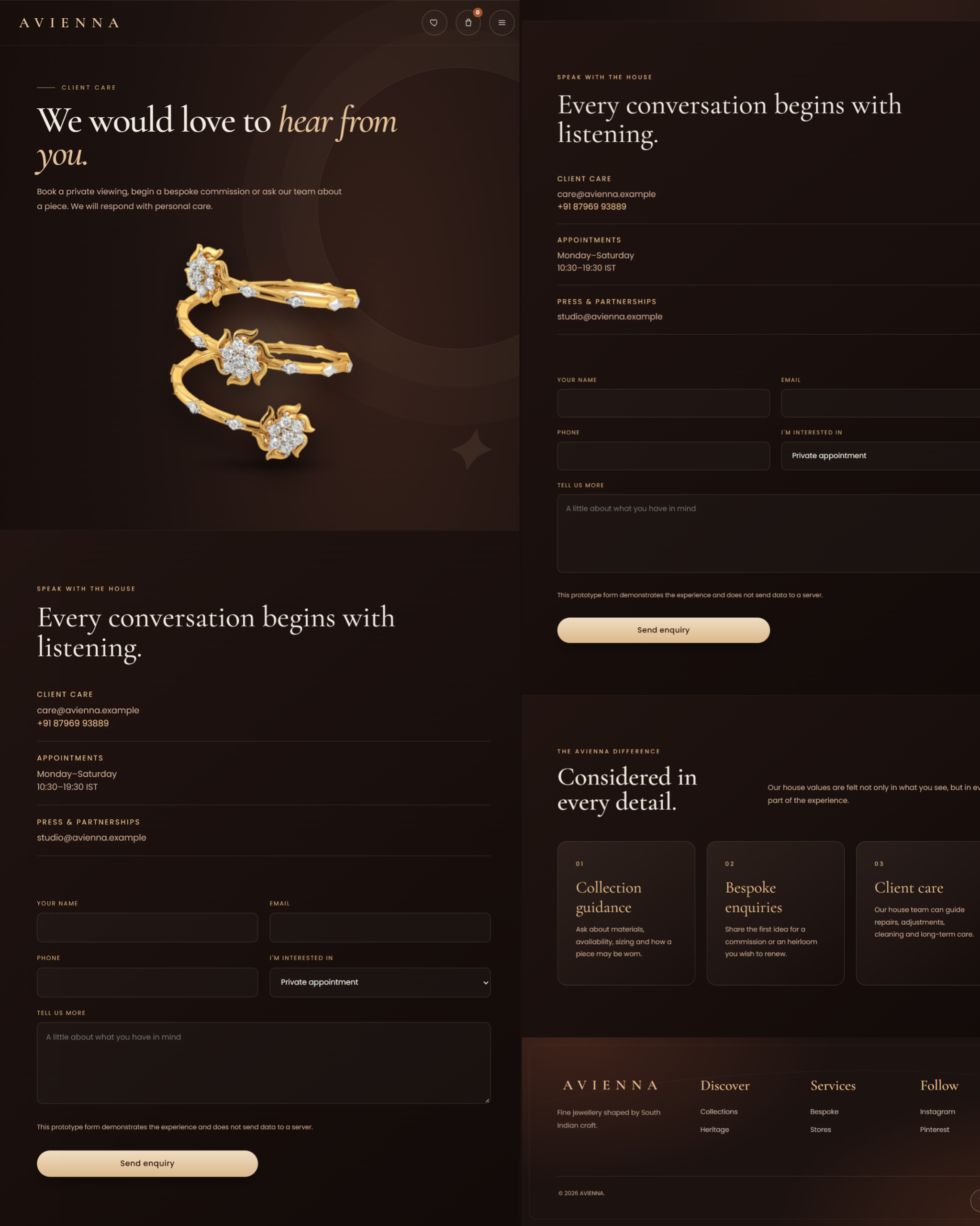
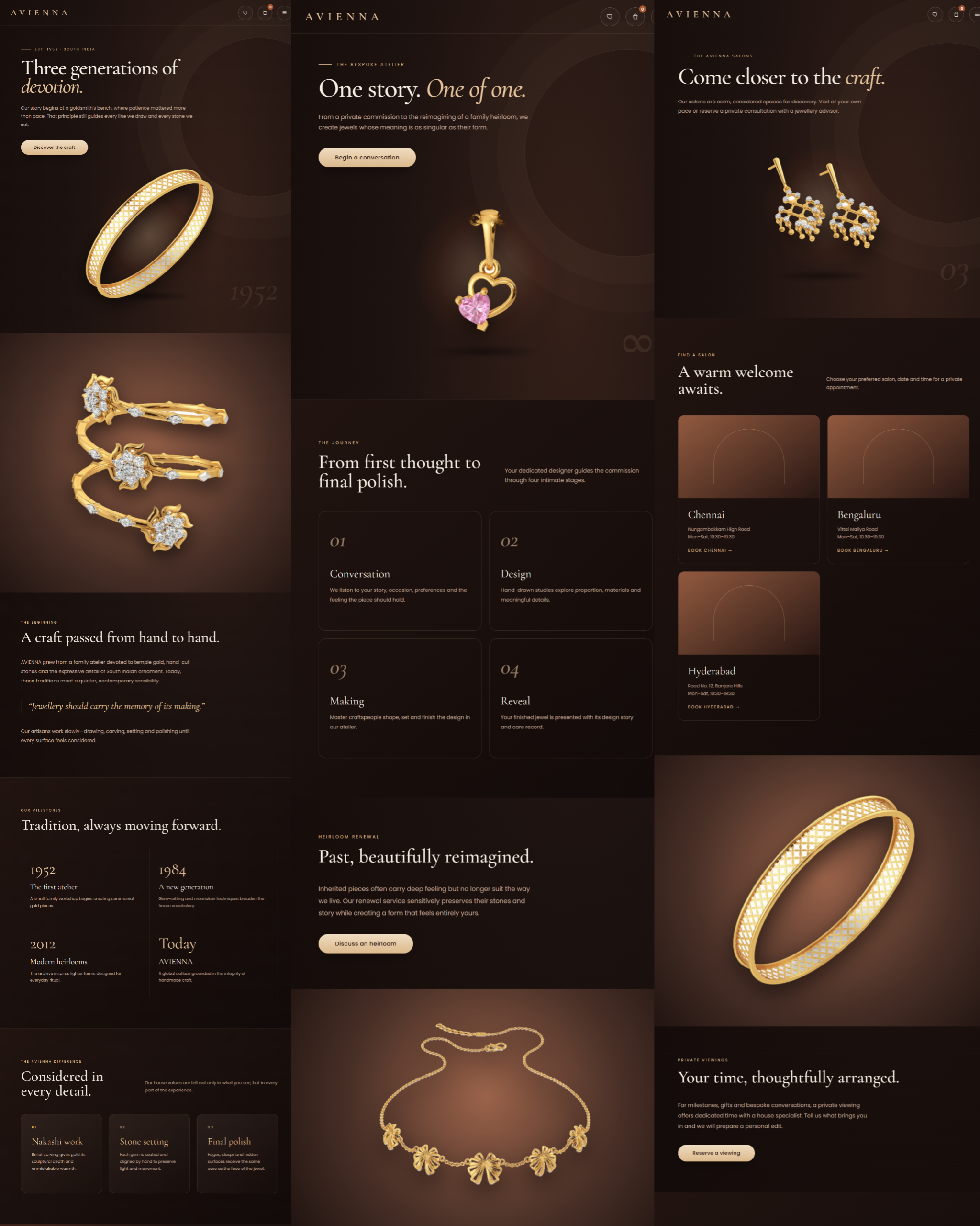
AVIENNA presents fine jewellery through a visual identity rooted in South Indian craft and heirloom-inspired design. Its website brings together signature collections, the brand story, bespoke commissions, and private viewing requests, giving visitors several ways to discover a piece and begin a conversation.

A piece of jewellery can lose much of its character when it becomes just another thumbnail in a product grid. The details, materials, and story need room to register, especially when the purchase is personal or tied to an occasion.
For AVIENNA, the website needed to hold that attention without making browsing difficult. Someone arriving for the first time should be able to appreciate the pieces, explore the collection, and understand how to enquire about a purchase or commission something personal.
I started with the jewellery itself. The opening screen places individual pieces against a deep, warm background, with a fan of selectable cards forming the main interaction. Choosing a card brings that piece forward and updates its name, materials, and price. A floating rotation effect adds movement to the presentation.
That interaction became the focal point of the homepage. The surrounding elements stay restrained: fine gold borders, subtle curves, soft glows, and enough space for the product and headline to hold their own.
Espresso, copper, and champagne gold carry the visual direction across the site. Cormorant Garamond gives the headings an expressive, elegant character, while Poppins keeps product details and navigation straightforward to read.
I gave the story and services their own space beyond the collection. The Heritage page introduces the brand narrative, while Bespoke explains how a commission develops from an initial conversation to the finished piece. The Stores and appointment pages support visitors who would prefer a private viewing.
The enquiry flow follows that personal approach. Visitors can collect pieces in their shopping bag or choose a preferred appointment, then continue through WhatsApp with their details already organised into a message.
Web Design · UI/UX · Frontend Development · Interaction Design · Responsive Design
My work covered the visual direction, page composition, product showcase interactions, and the frontend browsing and enquiry flows.
I also adapted the presentation for smaller screens. The wide card arrangement becomes a focused product display with selectable thumbnails, keeping the jewellery prominent without squeezing the desktop layout onto a phone.
The finished website gives AVIENNA a consistent visual presence from the first product interaction through to the collection, brand story, and enquiry pages.
A visitor can take different routes through it: browse and shortlist pieces, explore a bespoke commission, or request time at a salon. The shopping bag and appointment form organise the relevant details before handing the conversation over to WhatsApp.
The strongest part of the result is how the presentation and functionality work together. The jewellery gets room to hold attention, while the next step remains easy to find.
Features
A fan of selectable product cards brings featured jewellery forward with animated transitions, a rotation effect, and changing product details.
Category controls help visitors move between necklaces, earrings, and bracelets, with materials and prices displayed alongside the pieces.
Visitors can keep a shortlist and return to it in the same browser as they explore their options.
Customers can add or remove pieces, adjust quantities, and review an automatically updated total.
Selected items, quantities, and the total are assembled into a message, ready for the customer to send and discuss payment and delivery.
A dedicated page presents the brand narrative through a timeline and sections focused on craft and making.
The site explains the commission process through Conversation, Design, Making, and Reveal, alongside an introduction to reworking inherited jewellery.
Visitors choose a listed salon, preferred date and time, and share their interests before continuing to WhatsApp for availability confirmation.
Selectable thumbnails replace the desktop card fan on smaller screens, supported by mobile navigation and reduced-motion styling.
Colours &
Typography
The colours create a warm setting for the gold and gemstone imagery. Espresso forms the darkest backdrop, copper adds warmth to the gradients, and champagne gold carries the finer details and key actions. Ivory text keeps the reading surfaces softer than a stark white treatment.
Brand Colours
Typography
Tool Stack
 HTML
HTML CSS
CSS JavaScript
 GitHub
 Vercel