
Nyla Varen — A hypnotherapy website built around the first conversation, using thoughtful content, warm visuals, and a carefully paced layout to introduce the service before asking visitors to take the next step.
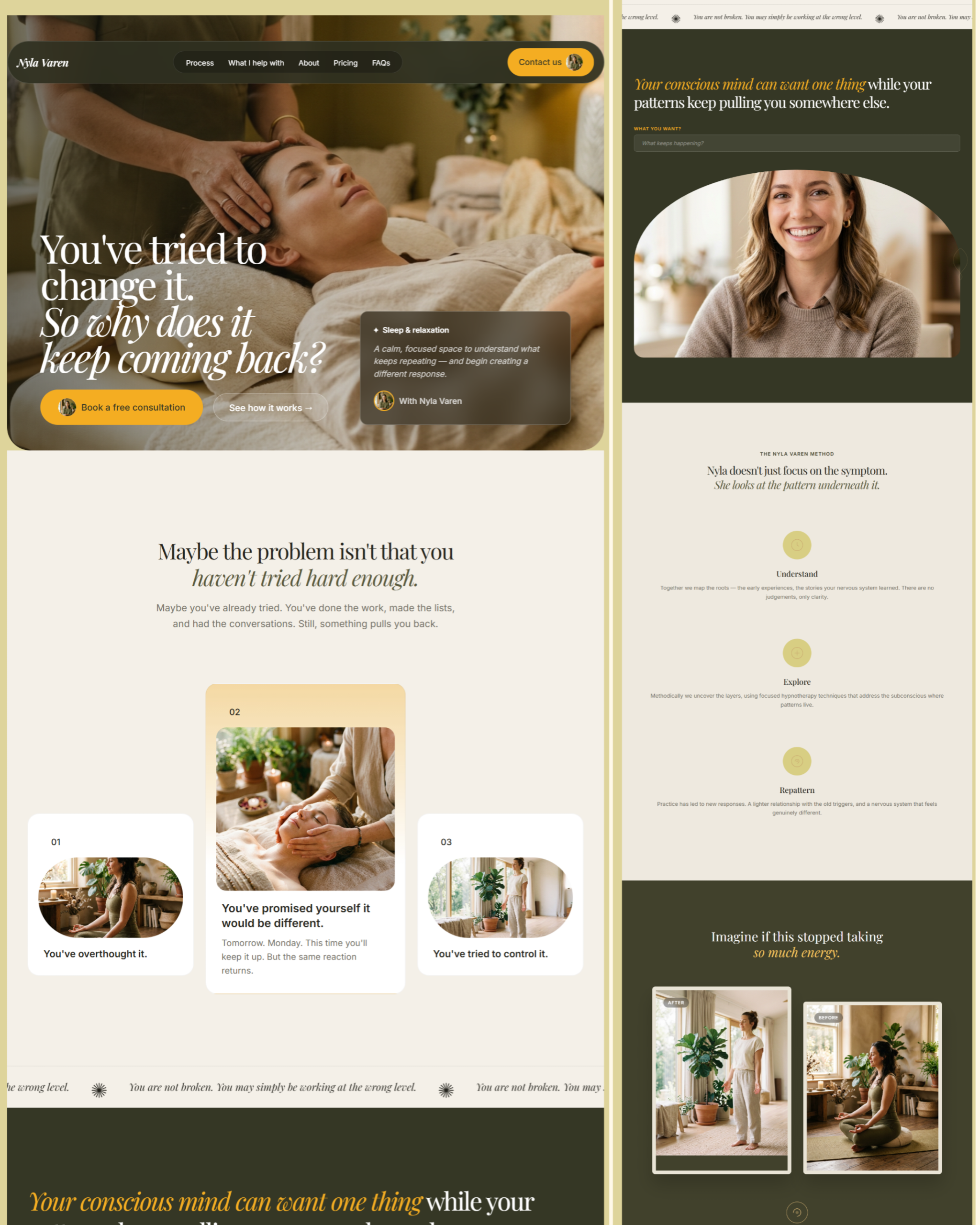
Nyla Varen presents hypnotherapy and pattern work for people exploring support with recurring habits, anxiety, confidence, stress, fears, and sleep. The website explains the service's approach, presents session options, and invites visitors to begin with a free consultation.

Reaching out for personal support can feel like a big step. Before sending an enquiry, someone may want to know what the sessions involve, what they cost, and whether there is room to ask questions without committing immediately.
The website needed to give those questions proper attention. A polished appearance alone would not explain the service or help visitors decide what to do next. The content and layout had to work together to make that introduction easier to follow.
I built the page as a conversation that develops as someone scrolls. The opening focuses on a familiar frustration: trying to change something and finding that it keeps returning. It gives visitors an immediate point of connection before introducing the method and the areas of support.
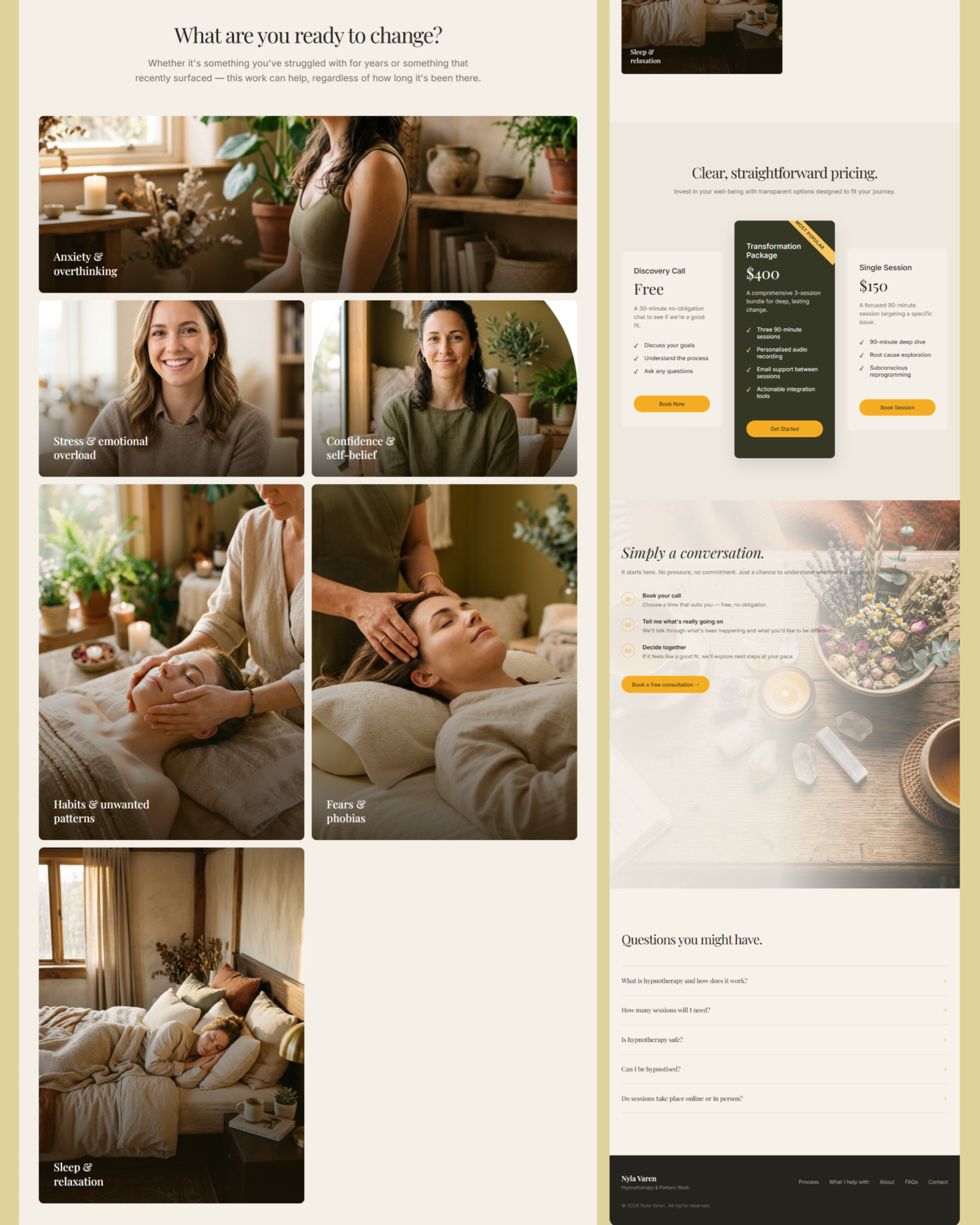
From there, the page moves into explanation. The three-part approach breaks the service into distinct stages, while image cards make the different areas of focus easy to scan. Pricing appears alongside what each option includes, so visitors can compare a discovery call, a single session, and a session package.
Visually, I wanted warmth without making the page feel overly decorative. Olive and ivory form the foundation, with golden yellow used to draw attention to consultation links. Large photographs, rounded edges, and open spacing give the content a less formal setting.
Playfair Display adds expression to the headlines, particularly through italic emphasis. Inter handles the practical details, giving the pricing, descriptions, and navigation a quieter visual voice.
The consultation section explains what happens after reaching out. Together with the FAQs, it gives visitors more context for making that first enquiry.
Web Design · UI/UX · Frontend Development · Content Structure · Responsive Design
I brought together the page structure, visual styling, responsive layouts, and frontend interactions. Much of the work involved deciding how to sequence the information so the service could be introduced gradually.
I also developed the supporting interface details, including the mobile menu, expandable questions, section navigation, and entrance animations.
The finished page brings the key information about Nyla Varen into a single, connected introduction. Visitors can move from recognising a concern to exploring the approach, comparing session options, and understanding the consultation process.
Email links give them a direct way to make contact when they are ready. The website provides a considered starting point for that conversation, with enough information to explore beforehand.
Features
The hero introduces the experience of recurring patterns, with clear routes to the service explanation and free consultation section.
Understand, Explore, and Repattern divide the stated approach into short, distinct explanations.
Image cards organise topics such as anxiety, confidence, habits, fears, and sleep into an easily scanned section.
Three pricing cards show the discovery call, session package, and single-session option, with their respective inclusions.
A numbered sequence explains making contact, discussing what is happening, and deciding on the next steps together.
Visitors can open answers to common questions about the service and session arrangements without navigating away from the page.
Contact and session buttons open an email enquiry, providing a simple route to the practitioner.
Section links, a dedicated mobile menu, and scroll-triggered reveals support movement through the page.
Colours &
Typography
Olive gives the page its earthy character, while ivory creates a warm backdrop for longer sections. Golden yellow makes the consultation buttons easy to locate. Charcoal anchors the navigation and darker elements, keeping the softer colours from feeling washed out.
Brand Colours
Typography
Tool Stack
 HTML
HTML CSS
CSS JavaScript
 GitHub
 Vercel